Predicting Airline Customer Satisfaction Ratings
Hey reader! Thanks for taking a look at this post. I wanted to test out R’s tidymodels package, so I decided to try it out on an airline satisfaction dataset (see https://www.kaggle.com/datasets/teejmahal20/airline-passenger-satisfaction).
The primary goal here is to try classifying whether or not an airline customer is “satisfied “or “neutral or dissatisfied”. Since there are only two possible outcomes for customer satisfaction, this is a binary classification problem.
Here is the layout of this post.
• Exploratory Data Analysis
• Feature Selection and Model Training
• Testing Results
Load in libraries
library(tidyverse)
library(tidymodels)
library(GGally)
library(vip)
library(cvms)
#Read in Data
df_data <- read_csv("dataset.csv") %>%
  select(-...1, -id)
Exploratory Data Analysis
Assess if there is a class imbalance
df_data %>%
  group_by(satisfaction) %>%
  count() %>%
  ggplot(aes(x = satisfaction, y =n)) +
    geom_col(fill = 'royalblue', position = 'dodge', width = 0.5) +
  ggtitle("Number of Records with Specific Satisfaction Label")
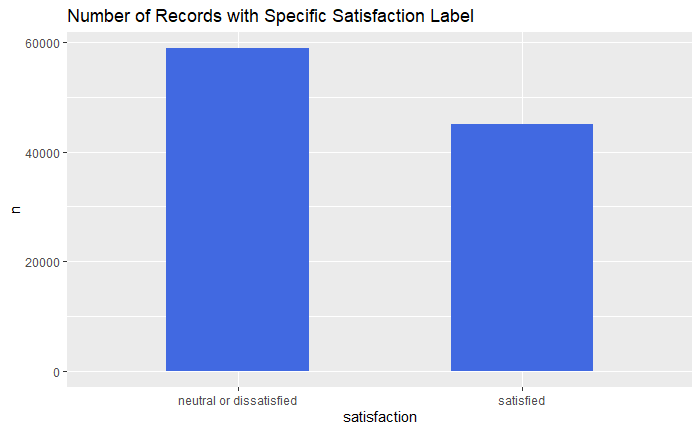
This actually does not look too bad. If there were a larger disparity, I might try to up/down sample here. However, since the imbalance seems ok, I am just going to move on to looking at the predictors.
Satisfaction by Customer Type
df_data %>%
  select(`Customer Type`, satisfaction) %>%
  group_by(`Customer Type`, satisfaction) %>%
  summarise(`Satisfaction Type Count` = n()) %>%
  ggplot(aes(x = satisfaction, y =`Satisfaction Type Count`, fill = `Customer Type`)) +
    geom_col(position = "dodge") +
  ggtitle("Satisfaction by Customer Type")
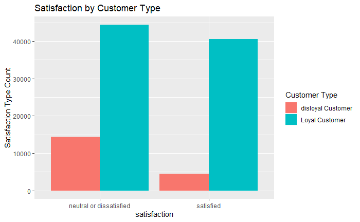
When looking at the above data, it seems strange that loyal customers occur more frequently for both “neutral or dissatisfied” and “satisfied”. I would expect loyal customers to rate their experience with the airline as “satisfied” as opposed to “neutral or dissatisfied”. However, looking more closely, it seems as though there are just more loyal customer overall compared to disloyal. This means we need to calculate the proportion of disloyal and loyal customers who rated their trips as “neutral or dissatisfied” or “satisfied”.
df_data %>%
  select(`Customer Type`, satisfaction) %>%
  group_by(`Customer Type`, satisfaction) %>%
  summarise(`Satisfaction Type Count` = n()) %>%
  group_by(`Customer Type`) %>%
  mutate(`Prop Satisfaction Type Count` = `Satisfaction Type Count`/sum(`Satisfaction Type Count`)) %>%
  ggplot(aes(x = satisfaction, y =`Prop Satisfaction Type Count`, fill = `Customer Type`)) +
    geom_col(position = "dodge") +
  ggtitle("Satisfaction by Customer Type (Proportion)")
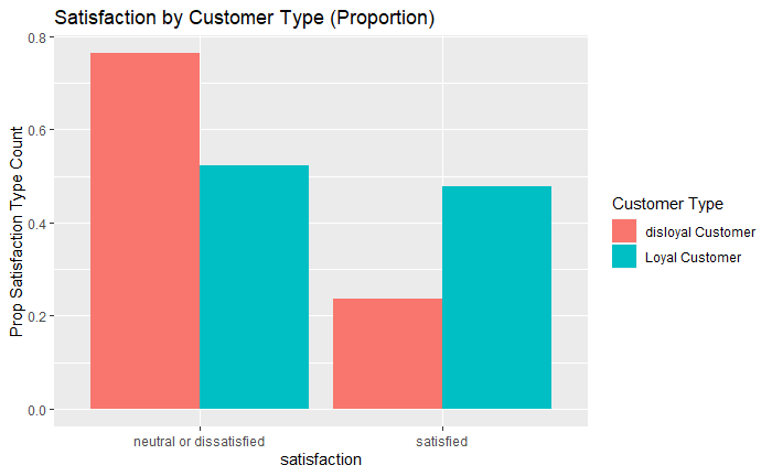
As we can see above, this makes more sense when compared to the previous figure. There is a higher proportion of disloyal customers who rated their experience with an airline as “neutral or dissatisfied” compared to “satisfied”
Next, I want to look at how continuous features compare when discretized by satisfaction score. For this, I will use histograms. Here is an example using customer age as a predictor.
df_data %>%
  select(Age, satisfaction) %>%
  ggplot(aes(x = Age, fill = satisfaction)) +
    geom_histogram(position = 'identity', alpha = 0.3) +
  ggtitle("Age by Satisfaction Type")
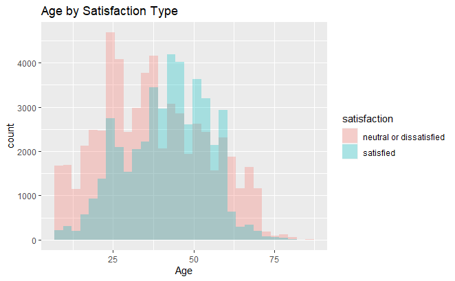
There seems to be little separation between the two distributions
Now that we have looked at some predictors, we need a more efficient way to look at all the predictors and their relation to the dependent variable of interest, customer satisfaction. To do this I will make a function that plots categorical and ordinal variables with bar charts and continuous variables with histograms.
multi_plot <- function(x, y){

  x_name <- as.name(x) #Cast at name type for use with ggplot

  #declare names of ordinal variables
  ord_vars <- c("Inflight wifi service", "Departure/Arrival time convenient",
                     "Ease of Online booking","Gate location", "Food and drink",
                     "Online boarding", "Seat comfort", "Inflight entertainment",
                     "On-board service", "Leg room service","Baggage handling",
                     "Checkin service", "Inflight service","Cleanliness")

  #Check if predictor is of type class "character"
  if("character" ==  y & !x %in% ord_vars){
    df_train %>%
      select(!!x_name, satisfaction) %>%
      group_by(!!x_name, satisfaction) %>%
      summarise(Count = n()) %>%
      group_by(!!x_name) %>%
      mutate(`Proportion` = Count/sum(Count)) %>%
      ggplot(aes(x = satisfaction, y =`Proportion`, fill = !!x_name)) +
      geom_col(position = "dodge") +
      ggtitle(paste(x, '- Satisfaction'))
  }

  #Check if predictor is of type class "numeric"
   else if("numeric" == y & !x %in% ord_vars){
    df_train %>%
      select(!!x_name, satisfaction) %>%
      ggplot(aes(x = !!x_name, fill = satisfaction)) +
      geom_histogram(aes(y=0.5*..density..), position = 'identity', alpha = 0.3) +
      ggtitle(paste(x, '- Satisfaction')) +
       ylab("Density")


  }
  # Plot ordinal data
  else if(x %in% ord_vars){
    df_train %>%
      select(!!x_name, satisfaction) %>%
      filter(!!x_name != 0) %>%
      group_by(!!x_name, satisfaction) %>%
      summarise(Count = n()) %>%
      group_by(!!x_name) %>%
      mutate(`Proportion` = Count/sum(Count)) %>%
      ggplot(aes(x =!!x_name , y =`Proportion`, fill = satisfaction)) +
      geom_col(position = "dodge", width = 0.5) +
      ggtitle(paste(x, '- Satisfaction'))
  }
}

#Get list of predictor names
variable_list <- colnames(df_data)[!str_detect(colnames(df_data), 'satisfaction')]

#Get predictor var types
pred_types <- lapply(df[,variable_list], class)

#Apply multi_plot to each image
map2(variable_list, pred_types, multi_plot) %>%
  patchwork::wrap_plots(
    ncol = 4,
    heights = 150,
    widths = 150)
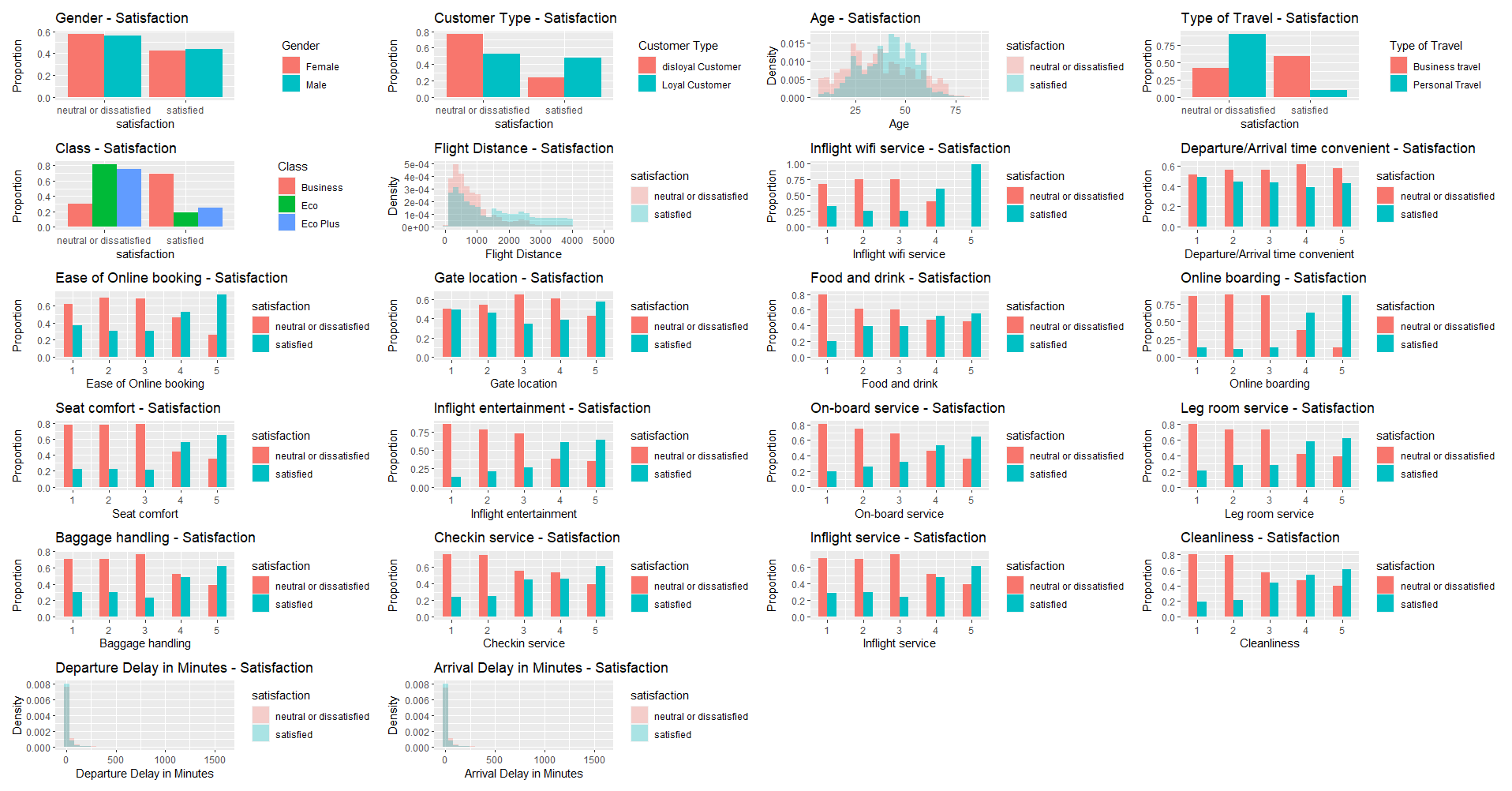
When looking at the above figures, it seems customer type, type of travel, class, inflight Wi-Fi rating, ease of online booking, food and drink, online boarding, check-in service, inflight service, and cleanliness may be useful features for predicting customer satisfaction scores. One way we can check this is by using a machine learning algorithm (i.e. random forest) to predict customer satisfaction with the above predictors and have it report to us which feature were most informative. But first we need to do some data preprocessing…
Feature Selection and Model Training
Tidy and split data into training and testing data
# Fix column name for training and test data
df_tidy <- df_data
colnames(df_tidy) <- str_replace_all(colnames(df_tidy), " ", "")

#Create train and test set
df_split <- df_tidy %>%
  initial_split(prop = 0.7, strata = satisfaction)

#Extract Training set
df_train_tidy <- df_split %>%
  training()
Create model recipe
customer_rec <- recipe(satisfaction~., data = df_train_tidy) %>%
  step_dummy(all_nominal_predictors()) %>%
  step_normalize(all_predictors())
Workflow for random forest model that displays predictor importance
cs_model <- rand_forest(trees = 500) %>%
  set_mode("classification") %>%
  set_engine("ranger", importance = "impurity")

cs_model <- workflow() %>%
  add_model(cs_model)%>%
  add_recipe(customer_rec)
Fit model And assess feature importance
vip_res <- rand_forest(trees = 500) %>%
  set_mode("classification") %>%
  set_engine("ranger", importance = "impurity") %>%
  fit(satisfaction~., data =  customer_rec %>% prep %>% juice())
vip(vip_res)
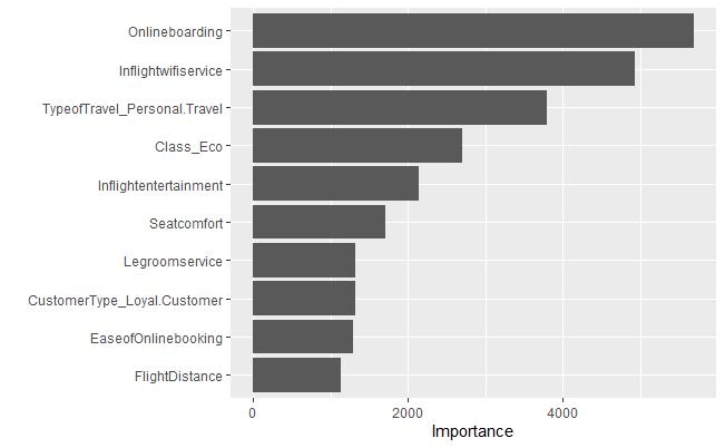
As mentioned previously, we can use models to assess feature importance. Using the above model, we can see that online boarding, in-flight Wi-Fi, type of travel, flight entertainment, leg room, customer type, ease of online booking, and flight distance were important predictors. As a result, I am going to use only these predictors for the models I train going forward.
k-fold Cross Validation and Model Training
set.seed(1001)
sat_folds <- vfold_cv(df_train_tidy, v = 5, strata = satisfaction)
Define models and perform hyperparameter tuning
# New model rec
customer_rec2 <- recipe(satisfaction~ Onlineboarding + Inflightwifiservice + TypeofTravel + Class + Seatcomfort + Legroomservice +
                        EaseofOnlinebooking + CustomerType + FlightDistance, data = df_train_tidy) %>%
  step_dummy(all_nominal_predictors()) %>%
  step_normalize(all_predictors())


#Logistic regression
logistic <-   logistic_reg(penalty = tune()) %>%
  set_engine("glmnet") %>%
   set_mode("classification")


# Knn
knn_spec <-
   nearest_neighbor(neighbors = tune()) %>%
   set_engine("kknn") %>%
   set_mode("classification")

# Random forest
random_forest <- rand_forest(trees = tune(), mtry = tune(), min_n = tune())  %>%
  set_mode("classification") %>%
  set_engine("ranger")
Setup workflow
wf <- workflow_set(
      preproc = list(normalized = customer_rec2),
      models = list(lr = logistic, knn = knn_spec,
                    rf = random_forest)
   )
Model tuning
grid_ctrl <-
   control_grid(
      save_pred = TRUE,
      parallel_over = "everything",
      save_workflow = TRUE,
      verbose = T
   )


grid_results <-
   wf %>%
   workflow_map(
      seed = 1503,
      resamples = sat_folds,
      grid = 5,
      control = grid_ctrl
   )
Plot model cross validation performance
autoplot(
   grid_results,
   rank_metric = "roc_auc",
   metric = "roc_auc",
   select_best = TRUE
) +
  geom_text(aes(y = mean - .01, label = c('random forest', 'knn', 'linear regression')), angle = 90, hjust = 1) +
  ylim(.5, 1) +
   theme(legend.position = "none") +
  geom_hline(yintercept = 0.5, lty = 2, lwd = 0.8, color = 'red') +
  geom_text(aes(1,0.5,label = 'Chance Pefromance for Binary Classification', vjust = -1, hjust = -.01)) +
  ggtitle("Cross Validation - Model Performance")
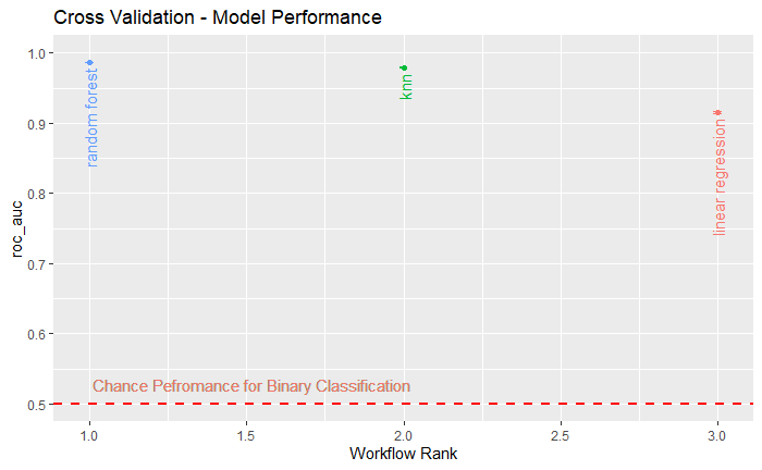
Based on the above figure, we can see that all three of the models had an area under the ROC above 0.9. However, the best model was the random forest. Since the random forest performed best, that is the model I will use.
Testing Results
Select Best model and plot confusion matrix
best_results <-
   grid_results %>%
   extract_workflow_set_result("normalized_rf") %>%
   select_best(metric = "roc_auc")


#Fit best model
rf_test_results <-
   grid_results %>%
   extract_workflow("normalized_rf") %>%
   finalize_workflow(best_results) %>%
   last_fit(df_split)
Confusion Matrix
collect_metrics(rf_test_results)

#Extract models predictions
preds <- rf_test_results$.predictions[[1]]$.pred_class
obs <- df_split %>%
  testing() %>%
  select(satisfaction)

#Create confusion matrix
cm <- confusion_matrix(targets = obs$satisfaction, predictions = preds)

#Plot confusion Matrix
plot_confusion_matrix(cm$`Confusion Matrix`[[1]])
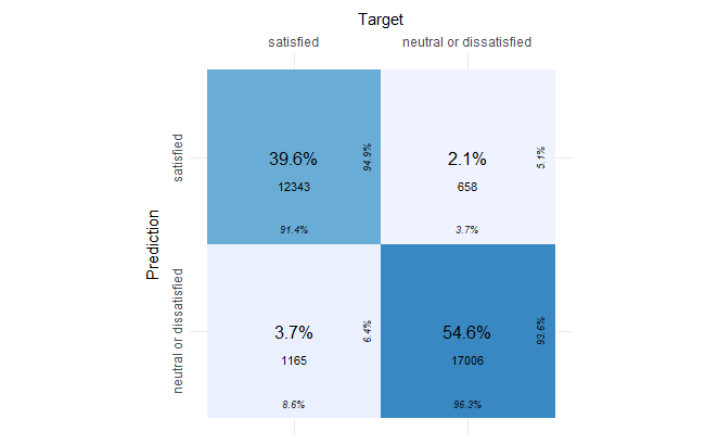
The confusion matrix shows us that the model was able to predict 94.9% of the “satisfied” labels correctly and 93.6% of the “neutral or dissatisfied” labels correctly on the testing set.
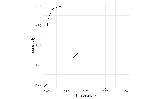
ROC Curve
rf_test_results$.predictions[[1]] %>%
  roc_curve(satisfaction, `.pred_neutral or dissatisfied`) %>%
  autoplot(lwd = 0.8)
Lastly, here is the ROC for the “neutral or dissatisfied” class.