Using Text Mining to Compare Trump’s (2020) and Obama’s (2016) State of the Union Address
5 minute read
Using the r package rvest, I was able to web scrape Trump’s (2020) and Obama’s (2016) state of the union addresses. I will create a different post that displays how I extracted the text from each webpage.
Import Libraries
options(warn=-1)
# Import libraries
library(tidyverse) #Reading csv files and data manipulation
library(tidytext) #Sentiment analysis and text analytics
library(tm) #Data cleaning
library(scales) #For data visualization
Import state of the union addresses and visualize data frames
#Import using readr
Obama_2016 <- read_csv('obama_2016.csv')
Trump_2020 <- read_csv('trump_2020.csv')

#Display Obama data frame
print("Obama 2016")
head(Obama_2016)

#Display Trump data frame
print("Trump 2020")
head(Trump_2020)
| X1 | text | President |
|---|
| 1 | Mr. Speaker, Mr. Vice President, Members of Congress, my | Obama_2016 |
| 2 | fellow Americans: Tonight marks the eighth year I've come here to | Obama_2016 |
| 3 | report on the State of the Union. And for this final one, I'm going to | Obama_2016 |
| 4 | try to make it shorter. I know some of you are antsy to get back to | Obama_2016 |
| 5 | Iowa. I also understand that because it's an election season, | Obama_2016 |
| 6 | expectations for what we'll achieve this year are low. Still, Mr. | Obama_2016 |
| X1 | text | President |
|---|
| 1 | Madam Speaker, Mr. Vice President, Members of Congress, the First Lady | Trump_2020 |
| 2 | of the United States, and my fellow citizens: Three years ago, we | Trump_2020 |
| 3 | launched the great American comeback. Tonight, I stand before you to | Trump_2020 |
| 4 | share the incredible results. Jobs are booming, incomes are soaring, | Trump_2020 |
| 5 | poverty is plummeting, crime is falling, confidence is surging, and our | Trump_2020 |
| 6 | country is thriving and highly respected again! America<U+0092>s enemies are | Trump_2020 |
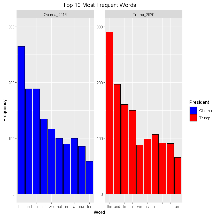
Let’s start by calculating the frequency of each word that occurs in both speeches.
#Combine both data frames
state_of_the_union_df <- rbind(Obama_2016, Trump_2020)

#Perform tokenization and calculate word frequencies
state_of_the_union_df_tidy <- state_of_the_union_df %>%
     group_by(President) %>%
     unnest_tokens(word, text) %>%
     count(word, sort = T)

#Display new data frame
head(state_of_the_union_df_tidy)
| President | word | n |
|---|
| Trump_2020 | the | 291 |
| Obama_2016 | the | 265 |
| Trump_2020 | and | 197 |
| Obama_2016 | and | 189 |
| Obama_2016 | to | 189 |
| Trump_2020 | to | 161 |
Plot the top 10 most frequent words to get a sense of some of the common words in both speeches.
#Pull top 10 most frequent words from each speech
top_10_df <- top_n(state_of_the_union_df_tidy, 10)

# Plot the most frequent words
ggplot(data = top_10_df, aes(x = reorder(word, -n), y = n, fill = President)) +
        geom_col(color = 'black') +
        facet_wrap(~ President, scales = "free") +
        ylim(0, 300) +
        xlab("Word") +
        ylab("Frequency") +
        scale_fill_manual(labels = c("Obama", "Trump"), values = c("blue", "red")) +
        ggtitle("Top 10 Most Frequent Words") +
        theme(plot.title = element_text(hjust = 0.5))
#More data preprocessing
state_of_the_union_df$text <- removeNumbers(state_of_the_union_df$text) #Remove number from speech
state_of_the_union_df$text <- removePunctuation(state_of_the_union_df$text) #Remove punctuation


#Perform the anti_join operation on the state_of_the_union_df_tidy data frame
state_of_the_union_removed_stopwords <- state_of_the_union_df %>%
     group_by(President) %>%
     unnest_tokens(word, text, to_lower = TRUE) %>%
     anti_join(stop_words) %>%
     count(word, sort = T)

#Pull top 10 most frequent words from each speech
top_10_df_nostop <- top_n(state_of_the_union_removed_stopwords, 10)

# Plot the most frequent words
ggplot(data = top_10_df_nostop, aes(x = reorder(word, -n), y = n, fill = President )) +
        geom_col(color = 'black') +
        facet_wrap(~ President, scales = "free") +
        ylim(0, 45) +
        xlab("Word") +
        ylab("Frequency") +
        scale_fill_manual(labels = c("Obama", "Trump"), values = c("blue", "red")) +
        ggtitle("Top 10 Most Frequent Words (Stopwords removed)") +
        theme(plot.title = element_text(hjust = 0.5), plot.margin = unit(c(5, 5, 20, 5) ,"mm"),
             axis.text.x = element_text(angle = 65, hjust = 1))
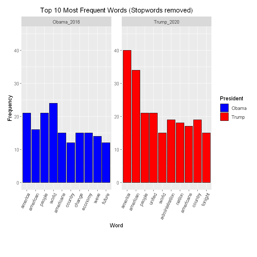
That looks much better.
Now, let’s visualize the similarity between Obama’s (2016) and Trump’s (2020) speeches
#Subset Obama and Trump speech
Obama_normalized <- subset(state_of_the_union_removed_stopwords, President == "Obama_2016")
Trump_normalized <- subset(state_of_the_union_removed_stopwords, President == "Trump_2020")

#Normalize word frequency
Obama_normalized$n <- Obama_normalized$n/sum(Obama_normalized$n)
Trump_normalized$n <- Trump_normalized$n/sum(Trump_normalized$n)

#Perform full join operation
Obama_Trump_normalized <- full_join(Obama_normalized, Trump_normalized, by = "word")

#Create scatter plot
ggplot(Obama_Trump_normalized, aes(x = n.x, y = n.y, color = abs(n.x - n.y))) +
  geom_abline(color = "gray40", lty = 2) +
  geom_jitter(alpha = 0.1, size = 2.5, width = 0.3, height = 0.3) +
  geom_text(aes(label = word), check_overlap = TRUE, vjust = 1.5) +
  scale_x_log10(labels = percent_format()) +
  scale_y_log10(labels = percent_format()) +
  scale_color_gradient(limits = c(0, 0.001), low = "darkslategray4", high = "black") +
  ggtitle("Relationship between Obama and Trump State of the Union Address") +
  theme(legend.position="none") +
  labs(y = "Trump 2020", x = "Obama 2016")
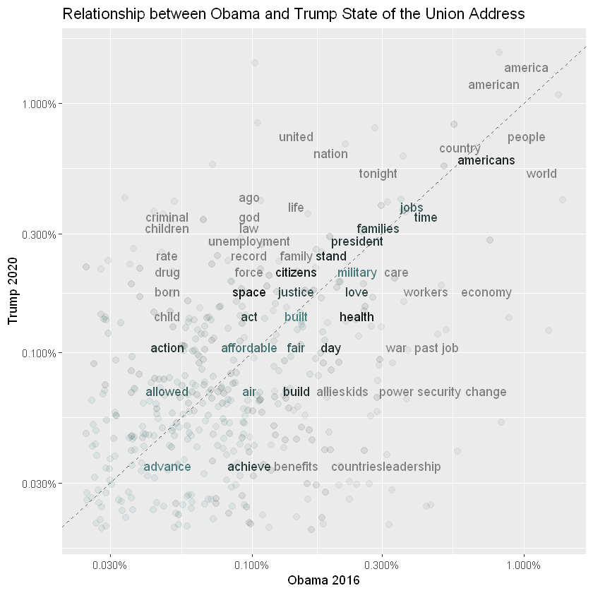
Pearson’s Correlation Coefficient (Quantifies similarity between the two speeches)
# Combine numeric vectors
Obama_Trump_Similarity <- cbind(Obama_Trump_normalized$n.x, Obama_Trump_normalized$n.y)

#replace NaNs with zero
Obama_Trump_Similarity[is.na(Obama_Trump_Similarity)] <- 0
#Calculate Correlation
speech_correlation <- cor(Obama_Trump_Similarity)
print(paste("Correlation between Trump and Obama Speech = ", speech_correlation[1,2]))
[1] "Correlation between Trump and Obama Speech = 0.397054611207509"
Different sentiment lexicons can be utilized in order to calculate the overall sentiment in particular texts. Below, I use the Bing sentiment lexicon which classifies words as either positive or negative.
#Calculate the difference  between the positive and negative sentiment
state_of_the_union_sentiment <- state_of_the_union_df %>%
     group_by(President) %>%
     unnest_tokens(word, text) %>%
     anti_join(stop_words, by = "word") %>%
     inner_join(get_sentiments("bing"), by = "word") %>%
     count(sentiment) %>%
     spread(sentiment,n,fill=0) %>%
     mutate(diff = positive - negative)

# Plot the sentiment difference
ggplot(data = state_of_the_union_sentiment, aes(x = President, y = diff)) +
    geom_col(fill = c("blue", "red")) +
    ylim(0, 60) +
    ylab("Positive Sentiment - Negative Sentiment") +
    ggtitle("Difference in Sentiment") +
    theme(plot.title = element_text(hjust = 0.5))
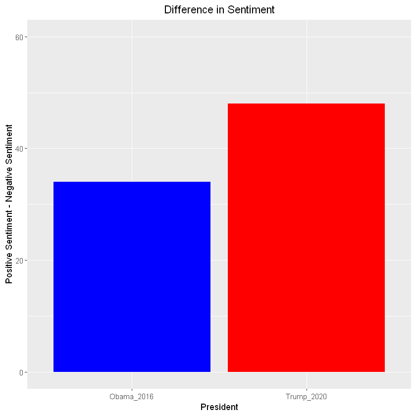
So, it look like Trump’s state of the union (2020) address was more positive overall than Obama’s state of the union address (2016). This could be a result of many different things, such as economy at the time and more.
Please note that the above sentiment difference was not normalized
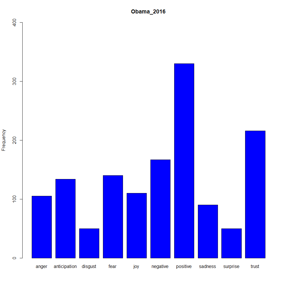
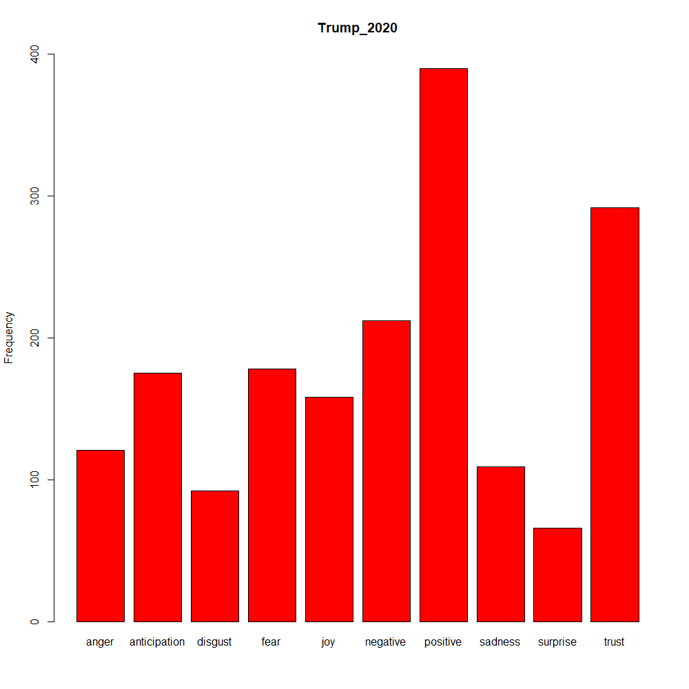
You can also use different sentiment lexicons via the tidy text package
state_of_the_union_sentiment <- state_of_the_union_df %>%
     group_by(President) %>%
     unnest_tokens(word, text) %>%
     anti_join(stop_words, by = "word") %>%
     inner_join(get_sentiments("nrc"), by = "word") %>%
     count(sentiment) %>%
     spread(sentiment,n,fill=0)

#Plot Obama and Trump Sentiment
barplot(as.matrix(state_of_the_union_sentiment[state_of_the_union_sentiment$President == "Obama_2016", 2:ncol(state_of_the_union_sentiment)]), col = "blue", main = "Obama_2016", ylim = c(0, 400), ylab = "Frequency")
barplot(as.matrix(state_of_the_union_sentiment[state_of_the_union_sentiment$President == "Trump_2020", 2:ncol(state_of_the_union_sentiment)]), col = "red", main = "Trump_2020", ylim = c(0, 400), ylab = 'Frequency')